Qu'est-ce que c'est?
Ce graphique présente la variation quotidienne de votre travail actif. Il vous aide à identifier les tendances d'arrivée ou de départ des éléments de travail sur votre tableau.
Avant de lire ce tutoriel, il est recommandé de lire le tutoriel sur le l'historique du travail en cours quotidien.
Partie 1 – Anatomie du graphique
Le graphique de variation quotidienne du WIP est un graphique bidimensionnel avec un axe X et un axe Y.
L'axe des X du graphique indique la période sur laquelle nous souhaitons représenter la variation quotidienne du travail en cours. L'axe des X couvre toujours une période passée, toujours exprimée en jours. L'axe des Y indique la variation quotidienne du travail en cours.
Visuellement, un graphique vide de la variation quotidienne du WIP ressemble à ceci :
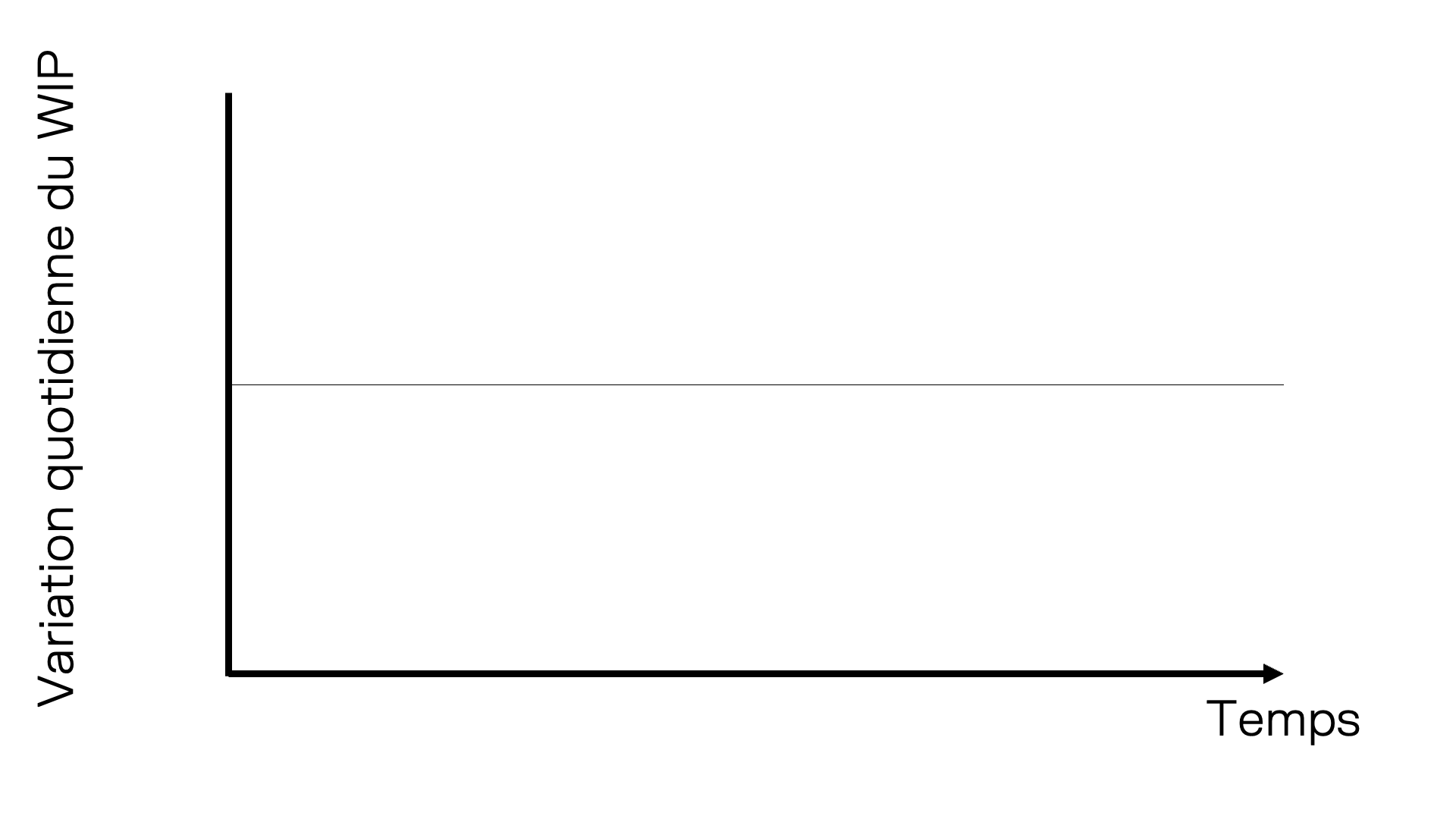
Pour afficher la variation quotidienne des tâches arrivées et terminées, une ligne horizontale centrale est tracée au milieu de l'axe des Y. Les tâches arrivées (ou ajoutées) sont affichées au-dessus de cette ligne centrale. Les tâches parties (ou terminées) sont affichées en dessous. L'image suivante illustre cette ligne.
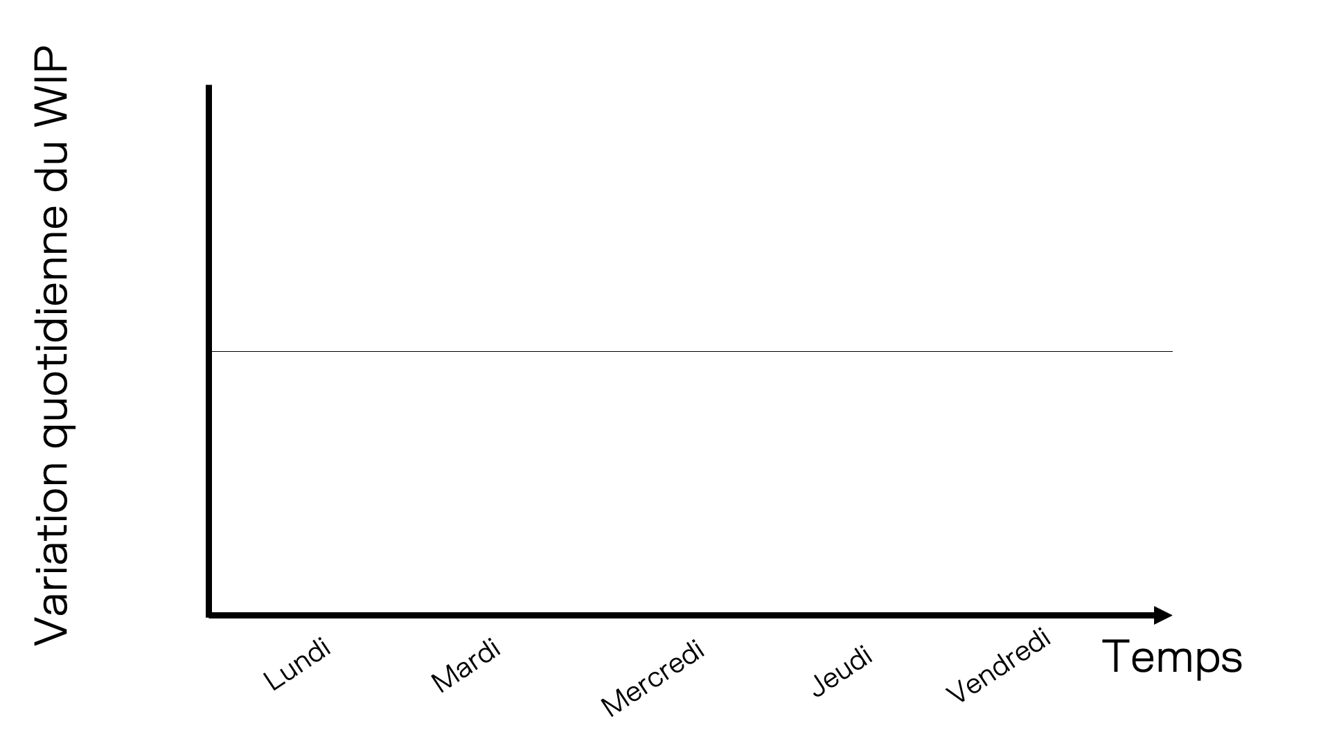
L'étape suivante consiste à ajouter des jours sur l'axe des X. Imaginons que nous soyons vendredi et que nous souhaitions voir la variation des travaux en cours sur les 5 derniers jours. Voici à quoi ressemble notre graphique.
Il est maintenant temps d'ajouter le nombre d'éléments de travail arrivés et terminés chaque jour. Voici la variation quotidienne des travaux en cours sous forme de grille :
| Jour | Tâches arrivées | Tâches sorties |
| Lundi | 4 | 1 |
| Mardi | 3 | 1 |
| Mercredi | 1 | 2 |
| Jeudi | 1 | 3 |
| Vendredi | 0 | 3 |
La lecture de ces données à partir d'une grille peut s'avérer complexe. Le graphique de la variation du travail en cours offre un moyen simple et efficace de les visualiser. Pour représenter ces variations quotidiennes, elles sont affichées sous forme de barres sur le graphique. Les éléments de travail arrivés se situent au-dessus de la ligne centrale et les éléments de travail terminés en dessous.
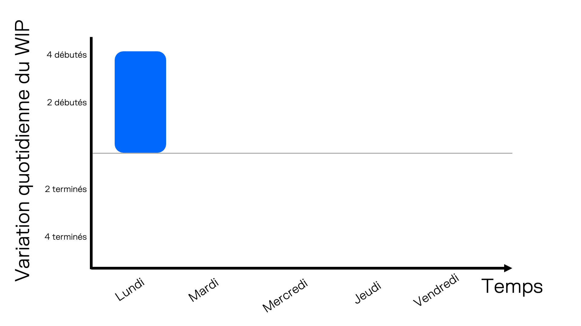
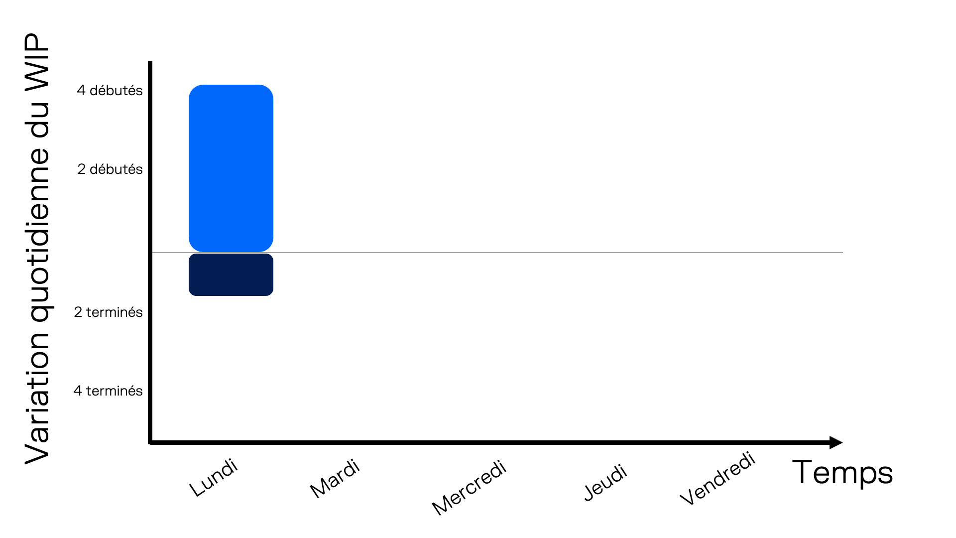
Commençons par ajouter les tâches arrivées lundi. Dans l'image suivante, la barre bleue indique qu'elles ont été ajoutées au tableau. Sa hauteur est de 4, ce qui indique que 4 tâches ont été ajoutées ce jour-là.
Ensuite, nous ajoutons le nombre d'éléments de travail qui ont quitté le tableau lundi. Dans l'image suivante, une barre bleu foncée est ajoutée sous la ligne centrale lundi. Cela signifie qu'un élément de travail a été terminé.
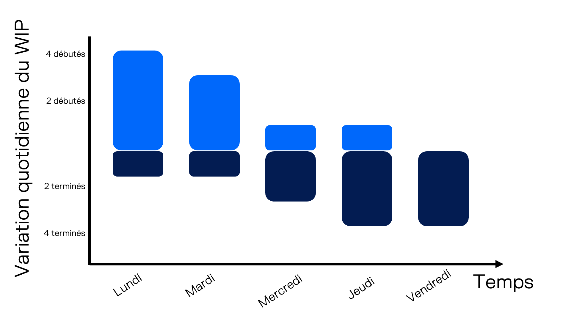
Enfin, nous ajoutons les éléments de travail ajoutés et terminés pour chaque jour sur le graphique. Voici la variation finale du WIP quotidien pour l'ensemble de la semaine.
Partie 2 – Quelle valeur tirez-vous de ce graphique ?
Bien que le graphique historique du travail en cours montre la tendance générale de vos activités, il n'en indique pas les variations quotidiennes. Ce graphique offre un niveau d'analyse supplémentaire sur les flux de travail entrants et sortants de votre processus.
Un exemple simple et récurrent se produit pendant le mois précédant les fêtes de fin d'année en Amérique du Nord. Le graphique suivant illustre les quatre semaines précédant les fêtes de fin d'année en décembre. On constate que le nombre de nouveaux éléments de travail est bien inférieur à celui des éléments terminés.
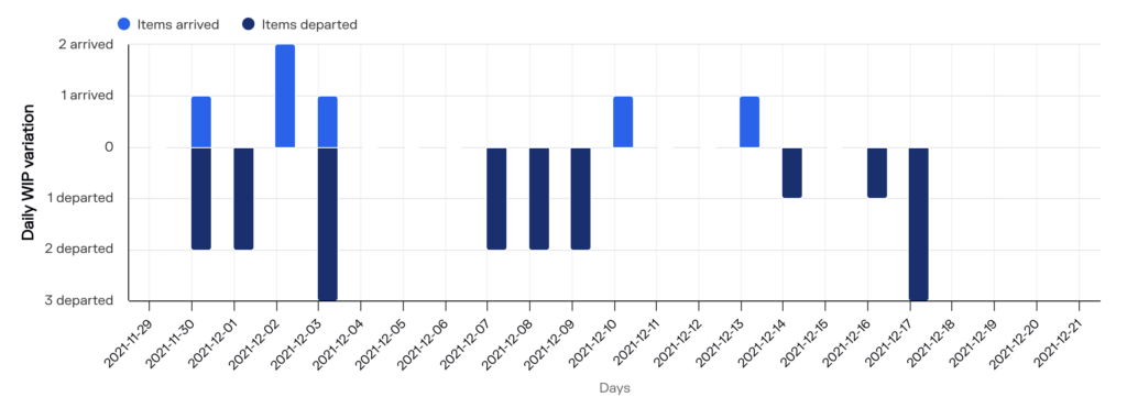
Au cours de la période indiquée dans le graphique ci-dessus, 6 éléments de travail sont arrivés et 18 sont partis.
Dans le graphique suivant, la variation quotidienne des travaux en cours montre que plus de 90 éléments ont été ajoutés les 13 et 14 février. Ensuite, pendant les trois mois suivants, quelques éléments quittent chaque semaine. Les données de ce graphique proviennent d'une organisation utilisant SAFe comme méthode de travail. Une grande quantité de travail a été sélectionné les 13 et 14 février, et pendant les trois mois suivants, les équipes se sont efforcées de la terminer.
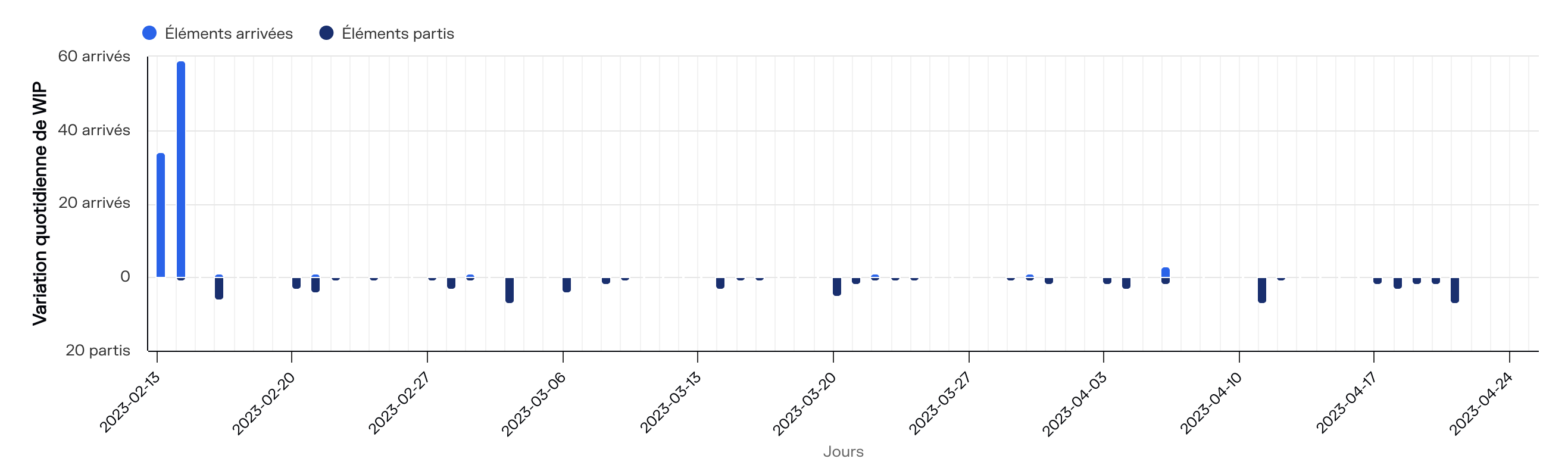
Ce graphique montre comment la variation quotidienne du WIP peut également être utilisée au niveau du produit ou du portefeuille pour voir comment le travail circule dans votre tableau.
Conclusion
Le graphique de la variation quotidienne du travail en cours offre une analyse précise des entrées et sorties de votre tableau. Il vous permet d'identifier les tendances. Pour en savoir plus, demandez un entretien gratuit avec notre équipe ou essayez Pacemkr gratuitement sur https://app.pacemkr.ca