The metrics and charts provided by Pacemkr offer a breadth and depth of transparency that your organization might never have had before.
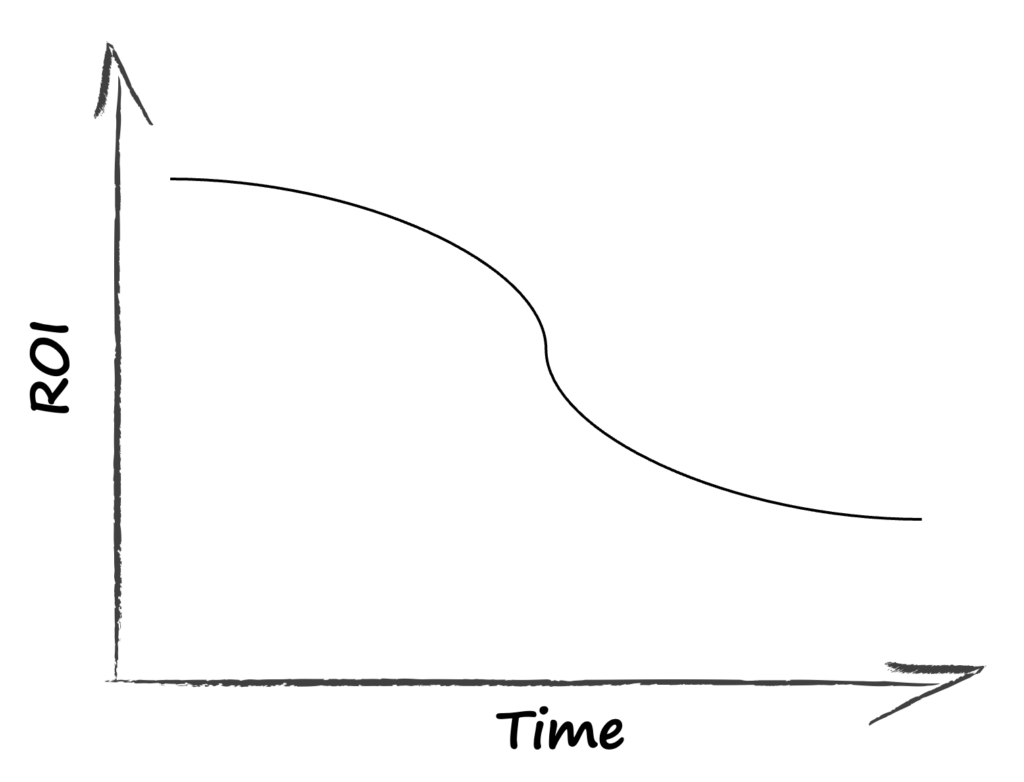
When we are talking with potential customers, they often ask us what is the Return-On-Investment (ROI) of Pacemkr. As fair question and the best way to answer this is to express it with the following curb:

On this curb, the X-axis shows the time from the first use of Pacemkr while the Y-axis shows the value of the ROI the customer had.
A recurring pattern when using Pacemkr is how the ROI is high in the first days or weeks of using Pacemkr. The main reason we’ve seen is how much transparency the charts offer to users. This extra visibility brings forward a whole set of new questions to your teams.
As time goes on, the ROI of Pacemkr drops. While this might sound disappointing for the customer, we believe this is a good thing. Once you’ve confronted your organization with all the hard questions brought up initially, Pacemkr becomes a companion to monitor and manage flow throughout your organization. We can attest to this as our oldest users now connect on Monday or Wednesday to check the flow of their teams. New users will connect almost daily to review and check their data, showing us they are at the top of the curb.
Curious to know more on how Pacemkr can have an impact on your organization. Contact us for a quick demo and see how it can provide insights beyond your data.