What is it?
While histograms are fairly an advanced notion when analysing your flow metrics, they can be of help for advanced users who have specific continuous improvement goals with their process.
Stated, a histogram is a graphical display of data that uses bars of different heights to show the frequency of various data points within an overall dataset.
More precisely, the advantage of this chart is that it gives you an overall idea of the shape of the distribution of your underlying data. Knowing this shape can give you some insight into the problem areas of your process.
In the first part of this tutorial, we cover the anatomy of a histogram to help read it. We then explain the benefits of reading specific histograms. Go to part 2 for specific histograms that you find in Pacemkr.
Let’s start by seeing how the histogram is built.
Part 1 – Anatomy of a histogram
The histogram chart is a 2-dimensional chart of an X and a Y-axis.
The chart’s Y-axis shows the frequency of your data, while the X-axis shows the data. The horizontal axis represents the ranges of intervals (or bins) that you are interested in
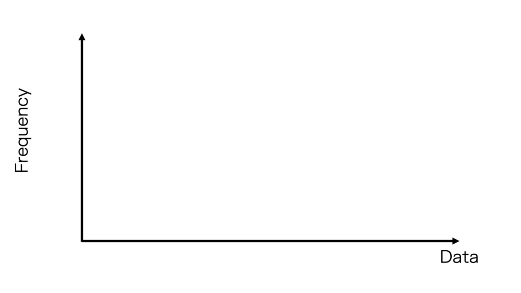
Visually, an empty histogram looks like this:
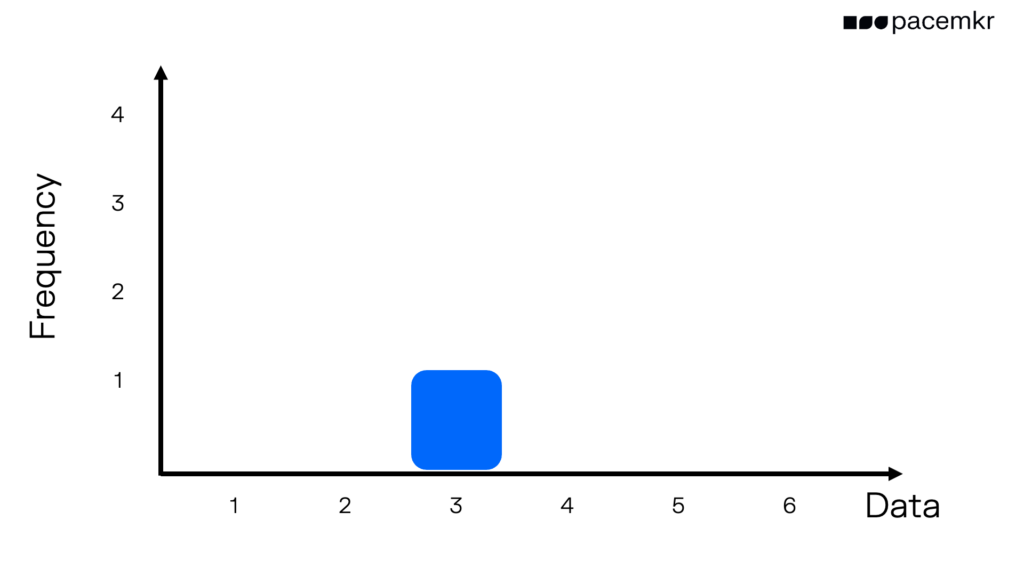
To illustrate how data is being shown on the histogram, let’s imagine we are rolling a 6 sided die. The first roll is a 3. In the following image, we put a bar at 3 with a height of 1 because we roll just one 3.
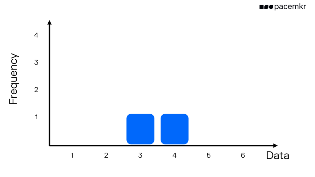
Our next roll is a 4. To display this result on the chart, we put a bar over the number 4 on the horizontal axis. The height of this bar is 1 because we roll just one 4.
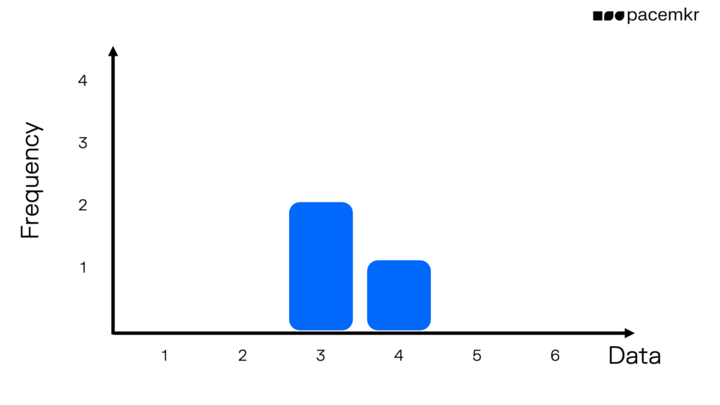
On our third roll, we got another 3. To see this second 3 in the histogram, we increase the height of the bar over the number 3 to a height of 2, meaning we rolled a 3 twice.
After rolling the dice 10 times, we get this distribution. If you add up the height of all the bars, you will get a value of 10.

This might be hard to understand, so let’s draw the frequency of each bar on another image. If you add up the numbers or frequencies, you will get a total of 10, which is the total number of rolls we did.

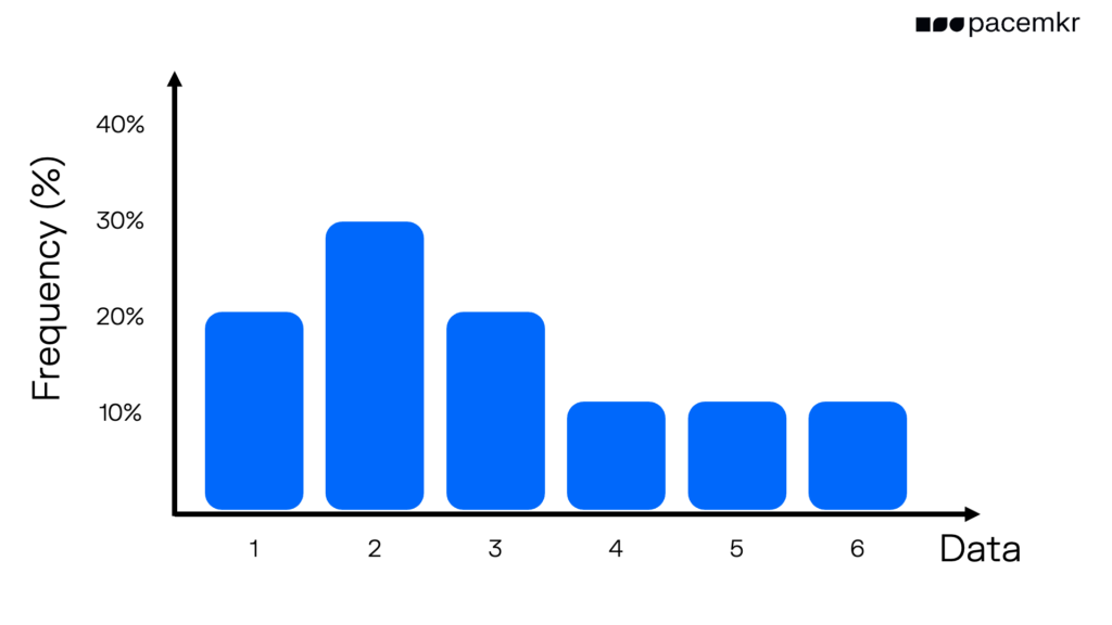
For a larger dataset, it can be preferable to use a percentage for the frequency. In the following image, notice the Y-axis. The percentage sign and the values are in percentages.
As this covers the basics of a histogram, let’s examine the value it brings to other charts: the cycle time scatter plot and forecasting.
Part 2 – Understanding the cycle time histogram
While the cycle time scatterplot is a temporal view of data to show trends over time, the cycle time histogram is a condensed spatial view based on the frequency of occurrence of cycle time.
Setting a new target
In this first example below, we see that the most frequent cycle time for completed work items is 1 day. This is shown with the bar on the complete left of the histogram. It shows that 90 items out of 700 items were completed in one day. This amounts to almost 23% of your completed items.
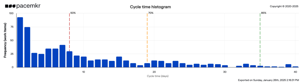
If your manager or internal customers would be challenge you that their requests take a lot of time in your team, you can answer that at least 23% of the requests took 1 day. While not perfect, this could help you set a goal on increasing it to 30% in the next 3 months, for example.
Investigating outliers
In the following example, we see 10 blue bars between the 70th and 85th percentile lines. This could indicate outliers where an abnormal situation prevented them from being completed under the 70th percentile.
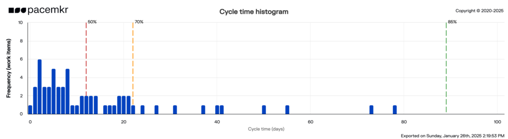
If you look closer at the 50th (12 days) and 70th (21days) percentiles lines, you notice they are closer than the distance between the 70th and 85th (89 days) percentile lines. You might want to investigate why there is such a difference between the 70th and 85th percentiles and take action on items aging above 21 days.
These are just two examples of the value you can get out of the histogram. As you get better at analyzing your data, this chart can add additional value to understanding and improving your process.
Conclusion
The histogram is a condensed, spatial view that shows the shape of your underlying data. They are used for more advanced analysis and forecasting techniques to improve even further our process efficiency and effectiveness. If you want to learn more about histograms, register for boot camp training or request a 30 minute meeting with our experts to learn how it can help you improve your process.