What Is It?
The cycle time scatter plot chart helps visualize the cycle time of your completed work items.
Before we go any further, it is essential to define the term cycle time:
Cycle time: The amount of elapsed time between when a work item started and when a work item finished.
Part 1 – Anatomy of the Chart
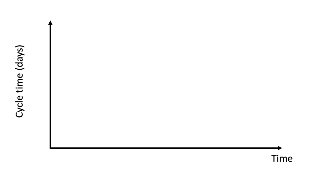
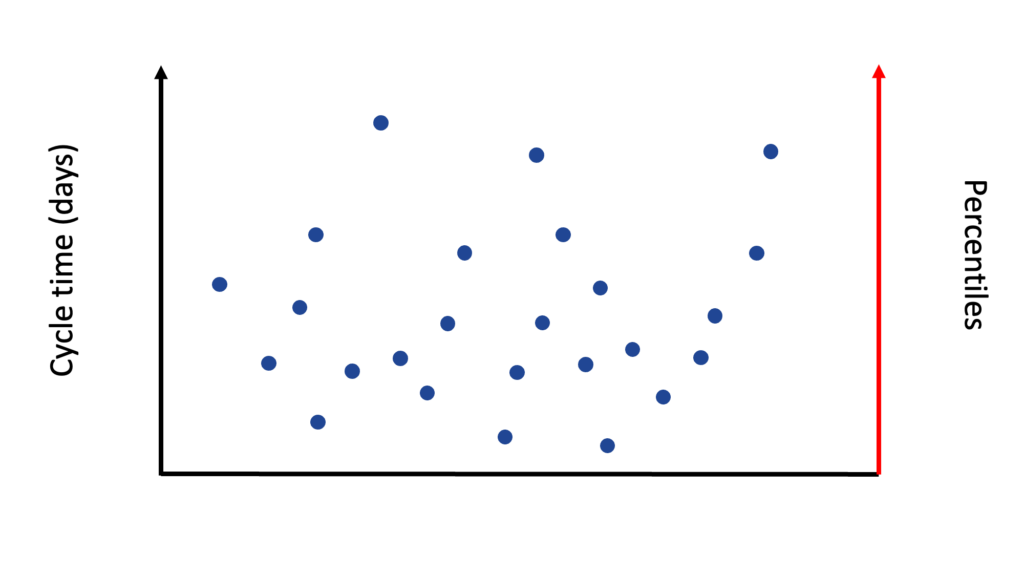
The cycle time scatter plot is a 2-dimensional chart of an X and Y-axis.
The chart’s X-axis contains the period on which we want to plot our data points. The X-axis of a cycle time scatter plot always covers a period set in the past.
The chart’s Y-axis will show the cycle time of each plotted work item.
Visually, a cycle time scatter plot looks like this:
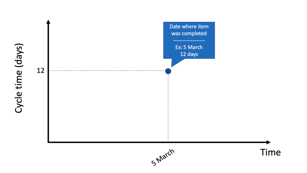
Our next step is to add completed work items to this chart. Let’s say we add a finished work item on March 5 with a cycle time of 12 days. In the image below, we can see how this point is represented in the chart.
It is also possible to have two completed work items on the same day. The image below shows that two work items were done on February 12. One item was completed in 4 days and the other in 9 days.

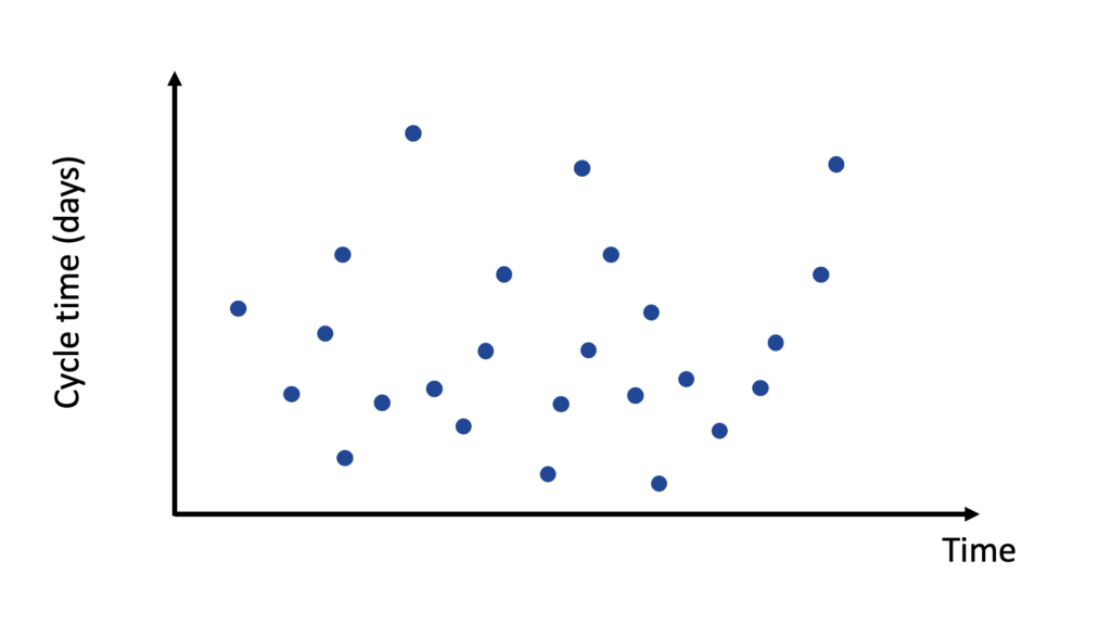
Finally, we get a full cycle time scatter plot chart when all of our completed work items are added to the chart.
Part 2 – Looking at a Completed Work Item
Using the cycle time scatter plot in Pacemkr, you can have more information on each data point by hovering your cursor above it, where a tooltip will appear.
Here is an example:
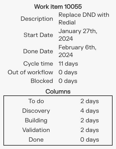
A completed work item tooltip has the following information:
- Identification (in bold at the top): Contains the work item ID and a link to the work item page in your project.
- Description: This is the description of the work item.
- Start date: The date at which the work item started.
- Done date: The date by which the work item was completed.
- Cycle time: The number of days between the start and done dates + 1.
- Columns: The number of days the work item spent in each workflow column.
Notice how we add a day to the cycle time calculation above. To understand why we do this, here is an example:
We started to work on an item on Monday, September 16, and completed it on Friday, September 20. If we subtract the dates 20 – 16, we get four days. But in reality, the work item might have started on Monday morning and was completed on Friday afternoon. This means we worked for 5 days on the item (Monday, Tuesday, Wednesday, Thursday, and Friday). We always add an extra day to the cycle time calculation to include the last day of work.
The same is true if the work item is started and finished on the same day. For example, a work item was completed in one day (March 15). The math, 15 – 15, gives us a cycle time of 0 days. As this doesn’t reflect reality, we add an extra day to include the last production day of the work item.
Part 3 – Service Level Expectation
Let’s go back to our previous example with this cycle time scatter plot chart.
By plotting how long each completed work item took, we can now forecast how long future work items will take. This is achieved through the use of percentile lines.
Percentile: a number where a certain percentage of scores fall below that number.
We can draw those percentiles on the cycle time scatter plot above in the following way. We start by drawing another Y-axis on the right side of the chart. This new axis will be our Percentile axis.
We then draw the first line at the 50th percentile. This new line means that 50% of our completed work items are either under or on this line. See the example below where 50% of the work items were completed in 6 days or less.
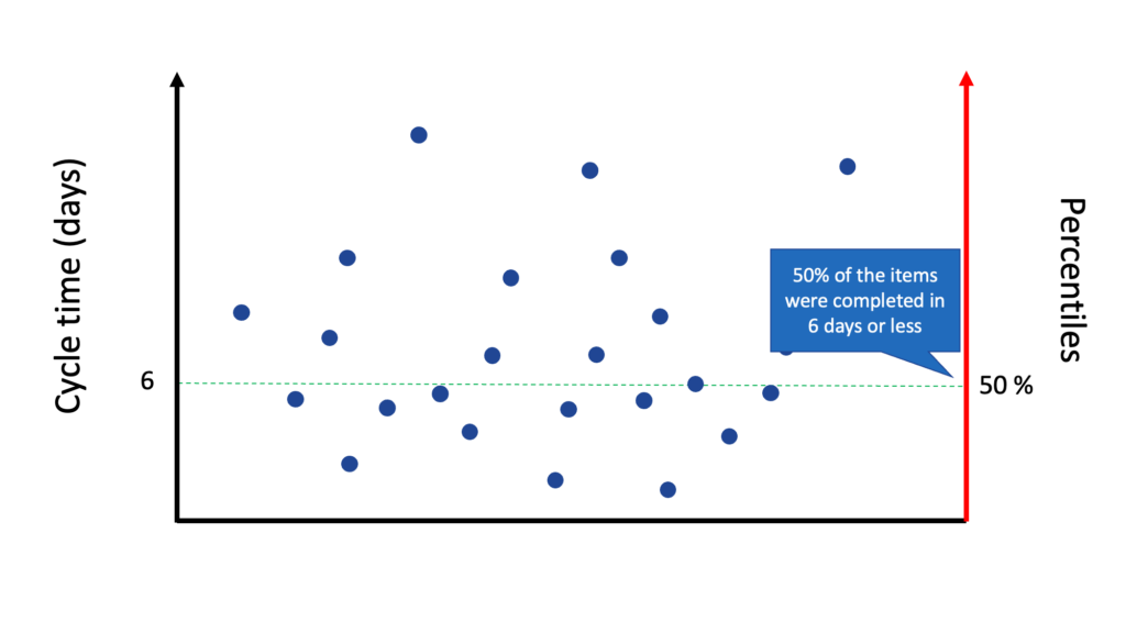
If your team starts to work on a new work item today, and your customer asks you for the expected due date, you can look at this image and tell him:
Based on the historical data of the team, there’s a 50% chance your work item will be completed in 6 days or less.
While this answers your customer’s question, it also means that there’s a 50% chance the work item will be completed in more than six days, something the customer might be uncomfortable with.
We draw a new percentile line at the 75th percentile to increase our confidence level. We can now tell our customer there is a 75% chance of completing the work item in 9 days or less.
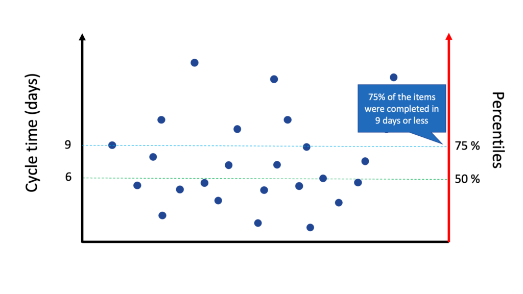
If your customer can accept this, you can use this percentile line as your forecasting.
But if you want an even more confident forecast, you can draw a third percentile line at the 85th percentile. At that line, there is an 85% chance that the work item will be completed in 12 days or less.
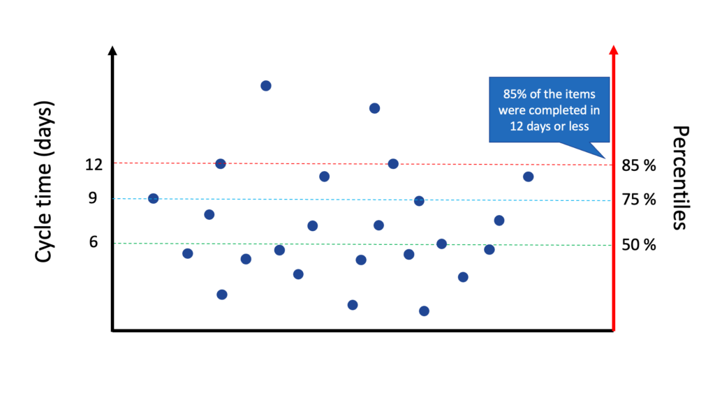
Pacemkr displays those percentile lines as shown in the image below.
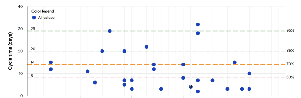
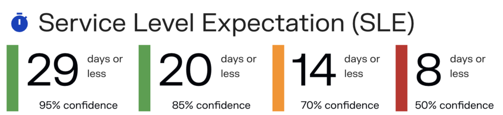
As it can be difficult to read those values directly in the chart, Pacemkr puts them on top of the chart so you can’t miss them. This section is called the Service Level Expectation (SLE)
Part 4 – Some Things To Consider
In summary, the cycle time scatter plot chart and its percentile lines are a way to create a forecast for a single work item. In PaceMkr, a forecast is always a value with a probability of the event happening. This is summed up in the Service Level Expectation (SLE) section, where you have different forecasts based on your confidence level.
At the beginning of this article, the cycle time definition we gave talked about elapsed time. This definition means that the cycle time in PaceMkr includes weekends and statutory holidays. PaceMkr can’t exclude these days from its calculation. At first, this might be inconvenient, but users soon discover how excluding statutory holidays is difficult when you have people spread out in different time zones and countries. For simplicity, we advise keeping elapsed days.