What Is It?
The throughput run chart visualizes the throughput of your team. A run chart is a line graph showing the changes in a data series over time.
Before we move forward, this is the definition of throughput used across Pacemkr:
Throughput: The number of work items finished per unit of time.
https://kanbanguides.org/
Part 1 – Anatomy of the Chart
The throughput run chart is a 2-dimensional chart composed of an X and Y-axis.
The chart’s X-axis contains the time we want to plot our data points. The X-axis of a throughput run chart always covers a period in the past.
The chart’s Y-axis shows the number of completed work items (or throughput) for the desired unit of time.
Visually, an empty throughput run chart looks like the example below.
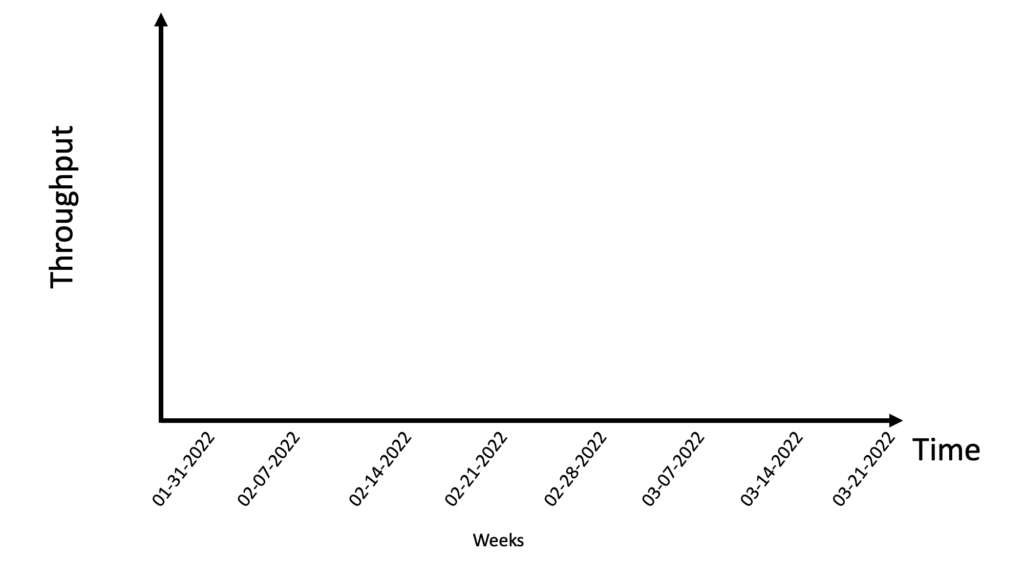
Our next step is to add a throughput on this chart. To do this, we need dates on the X-axis. We will plot weekly throughput, i.e. the number of completed work items per week, so we add dates on the X-axis. In the following image, the dates are all Mondays because we want to show completed work items for each week starting on Mondays.
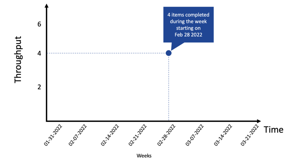
On the week that started on Monday, February 28, 2022, there were four completed work items during that week.
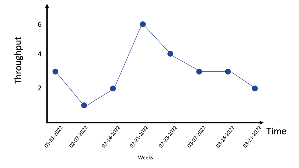
Then, we plot the additional throughputs on the chart, as shown in the image below:
Part 2 – Looking at a throughput
Moving your cursor on a blue dot in the chart will display a tooltip with a list of work items completed during this period.
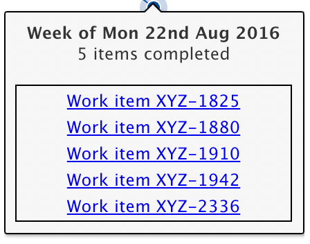
The tooltip shows the time of the throughput, the number of completed items, and a list of those items. Clicking on any one of them will take you to the work item page in your Agile project management system.
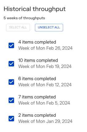
Part 3 – Selecting week
On the right-hand side of the chart, you will find a list of the weeks displayed on the x-axis . On some occasions, you might want to leave out some weeks.
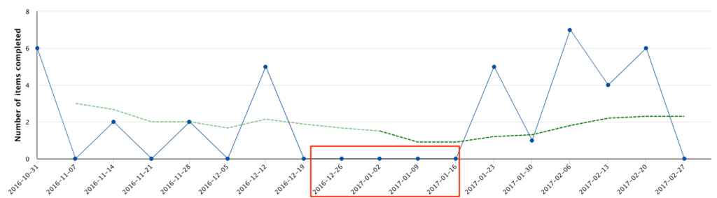
For example, you might want to exclude throughputs during the holidays if your team is on vacation and nothing happens at this time. The red rectangle in the following example shows a throughput of 0 completed work items during the holiday period. You can see that the rolling average is impacted by those weeks. In the following image, you can see how the throughput is at 0 completed work items during 3 weeks during the Holidays.
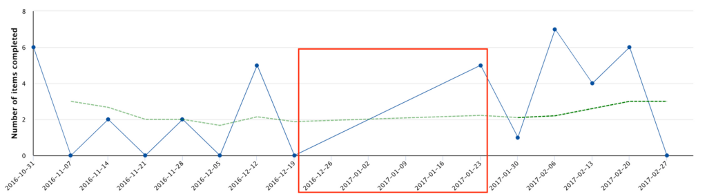
By unchecking these weeks, the forecasting of your delivery dates reflects your reality. The image below shows what the throughput run chart looks like without those weeks. This way, the rolling average gives a better picture of your team’s output.
Having abnormally high values is another reason to remove specific weeks. For example, the team cleaned up their board, closing more than 100 items in a particular week. These abnormally high values are shown in the image below by a red rectangle around the outlier. Not only will the resulting rolling average be skewed by this value, but the forecasting of your delivery dates will be misleading.
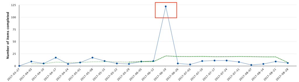
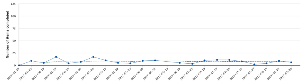
By unchecking weeks that do not reflect your team throughput, you better forecast your delivery dates. The image below shows the same throughput chart without the outlier. Notice how the rolling average has a lower value and respects the actual throughput of the team. The forecasting will also be more precise without the outlier.
Part 4 – Controls
At the bottom of the chart, you will find a list of controls to help you view and analyze your throughputs in different ways.
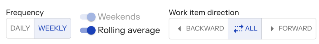
Frequency – Daily or Weekly
You can toggle your throughput to be daily or weekly. Some teams prefer to look at their throughput each week, while other groups look at it every day. It is usually a preference of how often they complete work items.
Weekends
When the daily throughput is selected, weekend throughputs are also shown on the chart and are included in the forecasting module of PaceMkr.
If your team doesn’t work on the weekends, you can exclude them from your forecasting by turning them off. The outcome of this option is more precise forecasting.
Rolling Average
If you do not work with rolling averages, you can turn this feature off. The green line on the chart will disappear. Some users also like to turn it off when they navigate the chart and don’t want any interaction with the rolling average line.
Work item direction
If you want to track work items that specifically went backward somewhere in the workflow, it is possible to filter those work items by clicking the ‘Backward’ button. Clicking ‘Forward’ will only display work items that went always forward.